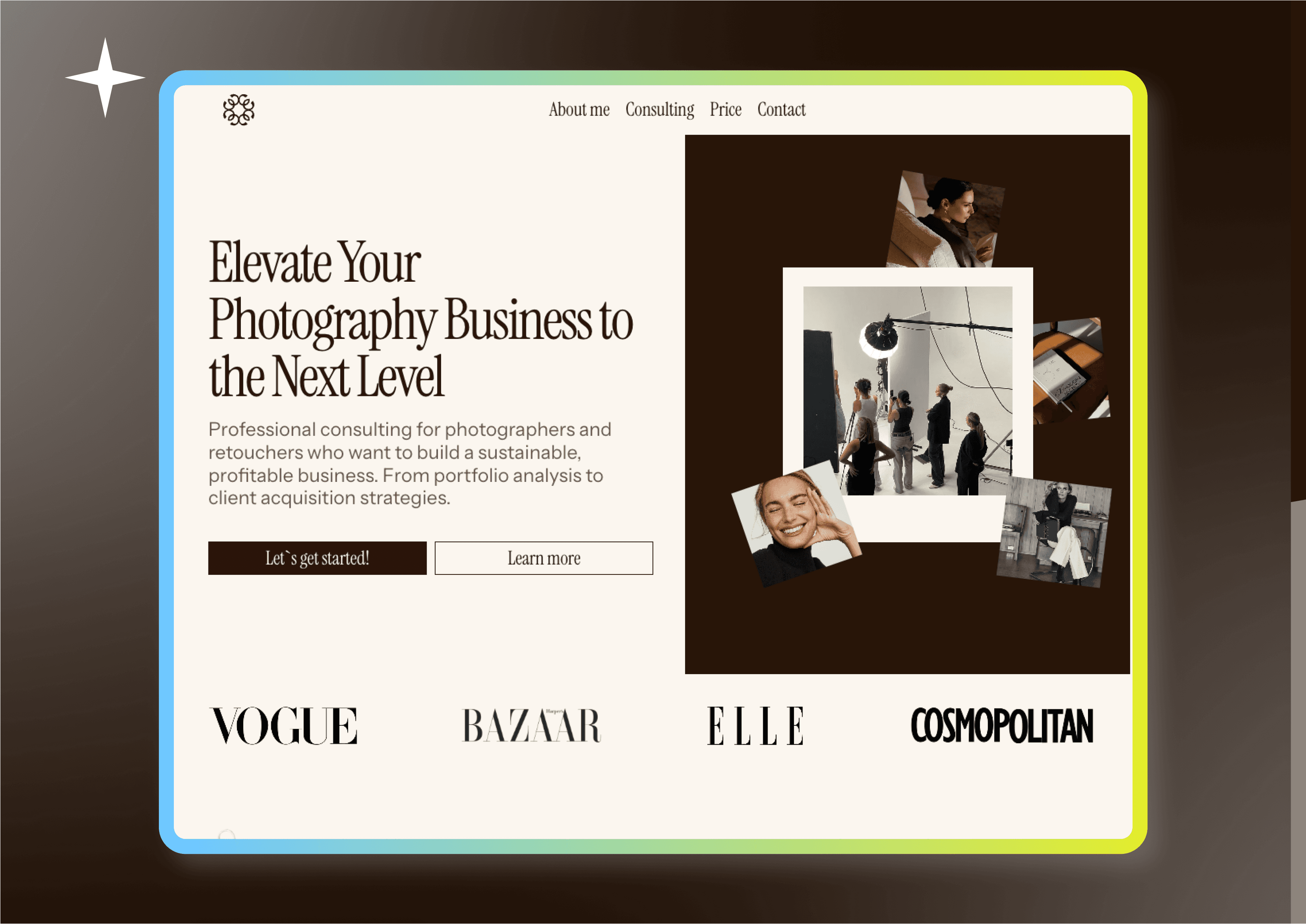
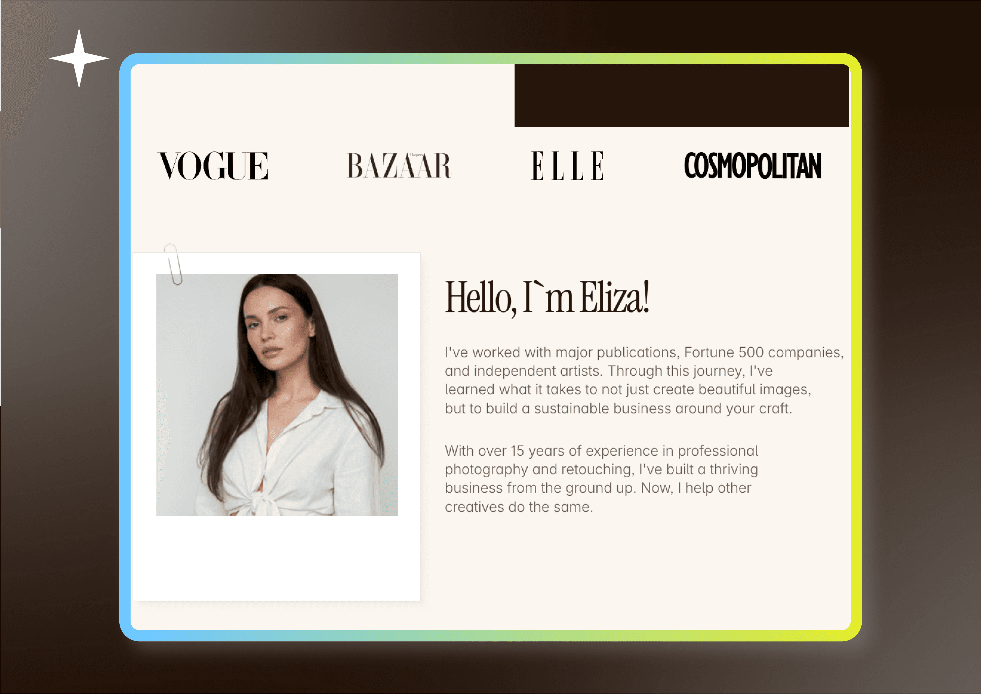
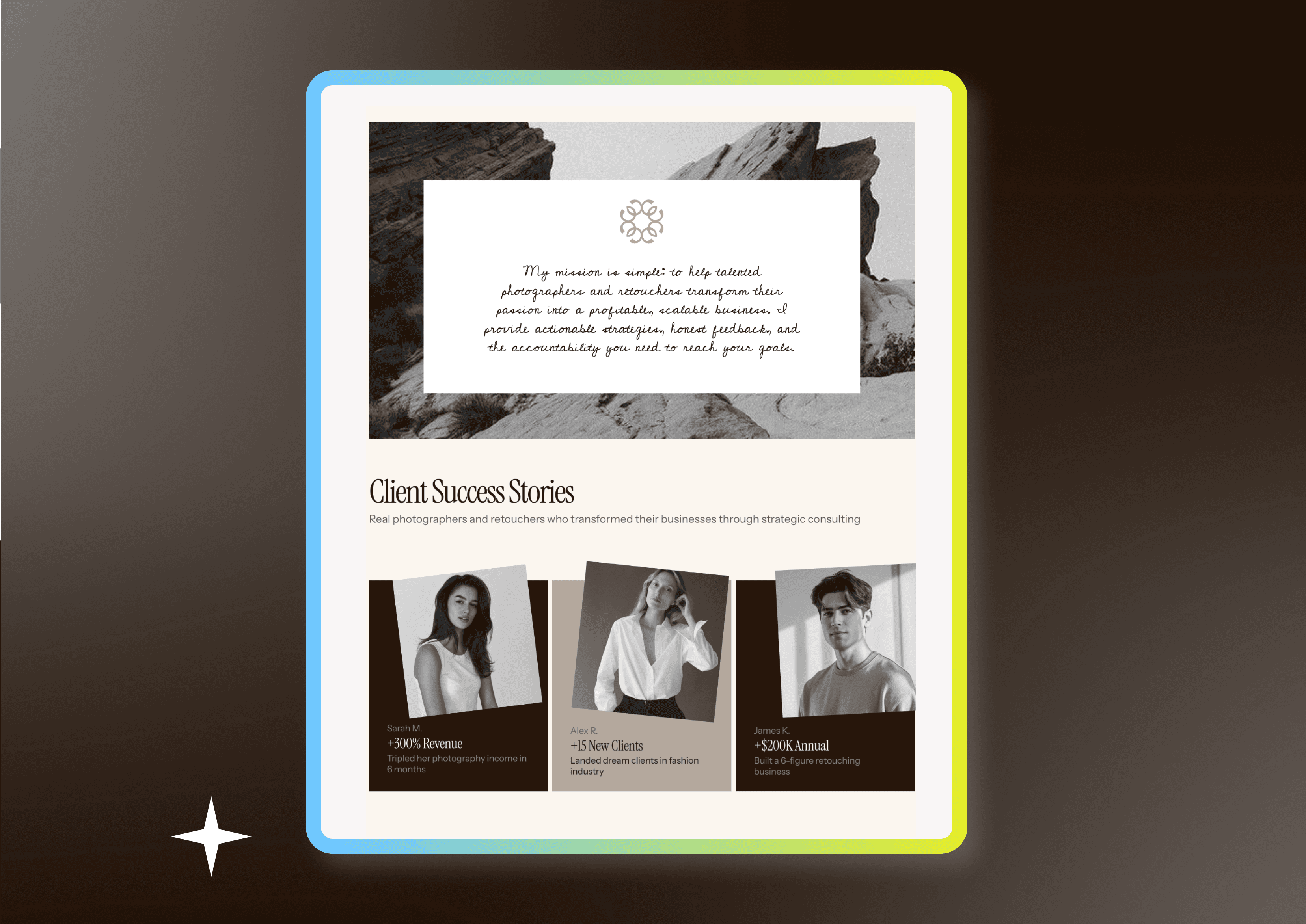
Eliza Photographer Mentor
Category
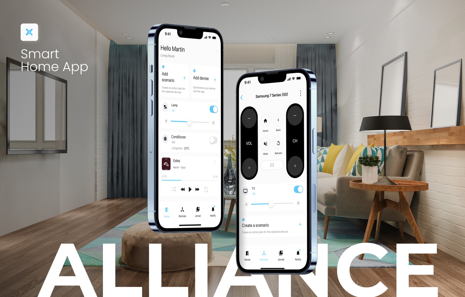
UX researcher| Web designer & Framer developer
Category
UX researcher| Web designer & Framer developer
Category
UX researcher| Web designer & Framer developer
UX challenge
Uniqueness
Designing a website that feels custom and premium, not “template-like”;
Information Architecture
Creating a clear narrative for the agency: services, process, and value proposition;
Scalability
Building a structure that allows fast updates and content scaling without breaking layout or design;
Functionality
Implementing advanced Framer features (components, CMS, interactions) while keeping the site easy to maintain.
UX challenge
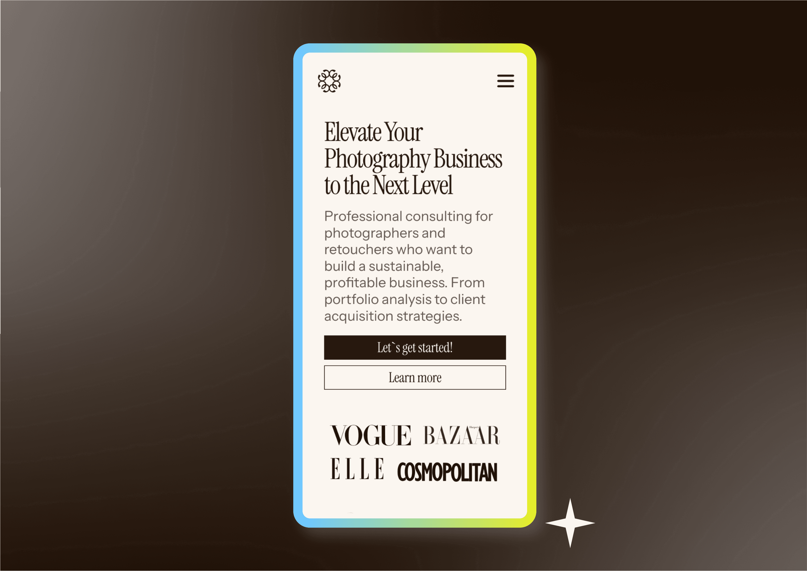
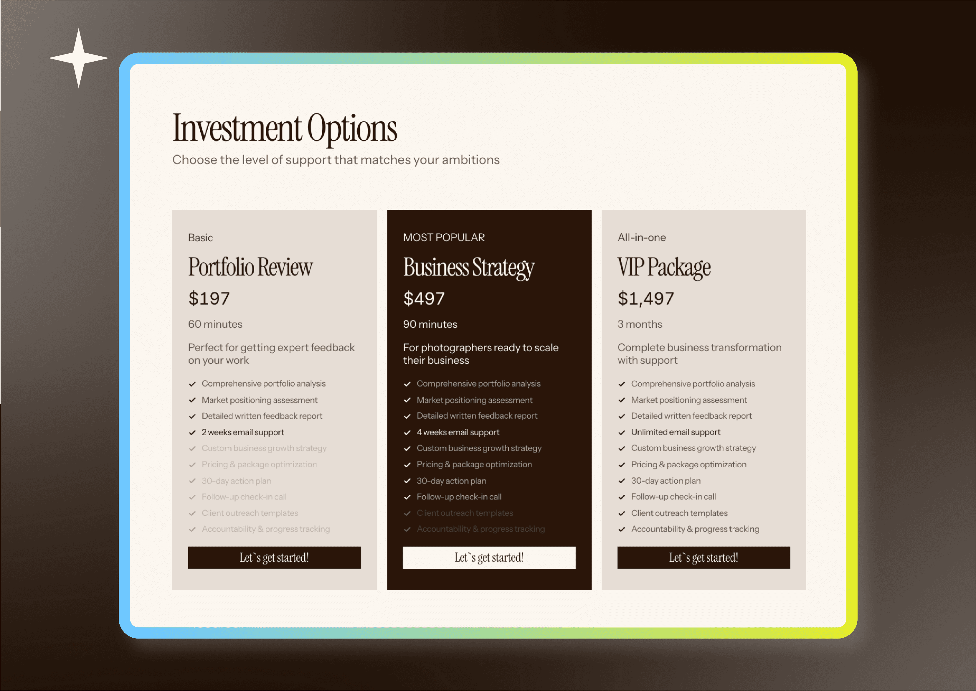
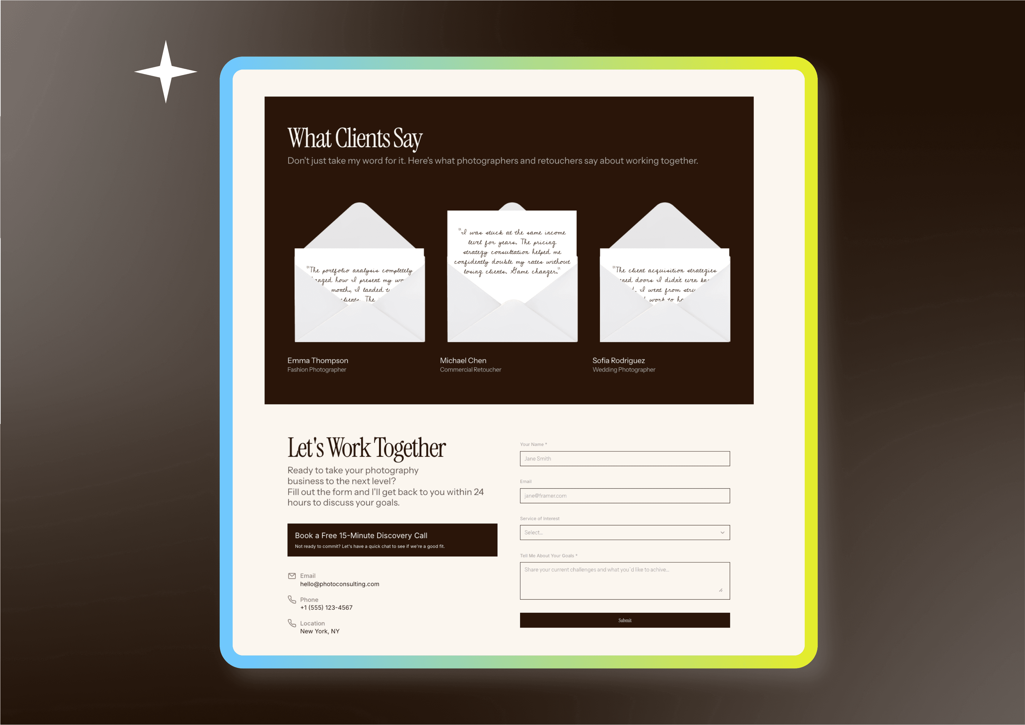
The client already had a basic structure, but the site lacked clarity, visual hierarchy, and emotional tone. It felt raw and unfinished, which reduced trust and perceived expertise. Goals of the project: - Increase trust and professional credibility - Attract clients to 1:1 consultations - Improve clarity of content and section logic - Create a strong visual and emotional first impression without a full redesign
Process
I worked on a fully custom Framer project (no templates), focusing on refinement rather than rebuilding from scratch. My process included: - Improving typography and spacing to create a clear visual hierarchy - Refining the layout to guide users smoothly through the page - Aligning visual style with the mentor’s personal brand and tone of voice - Enhancing UX by simplifying content structure and calls to action - Implementing and configuring everything directly in Framer, including responsiveness The focus was on balance: clean, minimal visuals combined with warmth and personality.
Result
In 2 days (8–10 hours), the website was transformed into a cohesive, professional landing page that feels confident, calm, and trustworthy. Outcome: - Clear and structured storytelling - Stronger personal brand presence - Improved usability and readability - A polished Framer implementation ready for real client traffic

Behance
Explore more my UX projects